AdSenseCharts.com
Google AdSense Reports


AdSenseCharts.com |
Free charts based on your Google AdSense Reports |
|
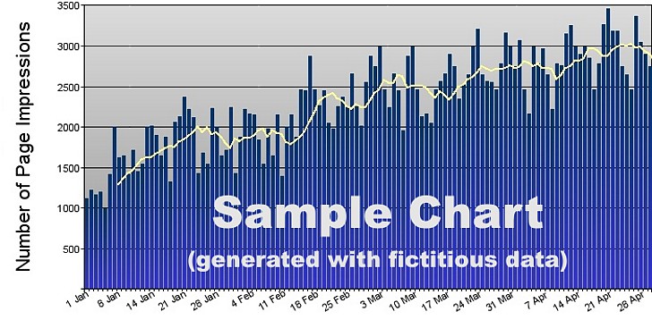
This sample was generated using fictitious data to give you an idea of the quality of our AdSense charts. The X-axis in this sample defines the date, and the Y-axis represents the number of daily ad impressions as provided by Google AdSense reports. The bright line indicates a seven-day moving average and is particularly useful in monitoring trends. Whenever you paste data on our homepage, you will have access to all of the following charts: |
||
|
|
|
|
Remember, use of our website is safe. The data that you paste on the AdSenseCharts homepage is encrypted into a temporary directory and then automatically deleted. Put simply, we believe that your data is yours - we never look at it, and don't even have access to it. | ||
AdSenseCharts.com |
Free charts based on your Google AdSense Reports |
|